
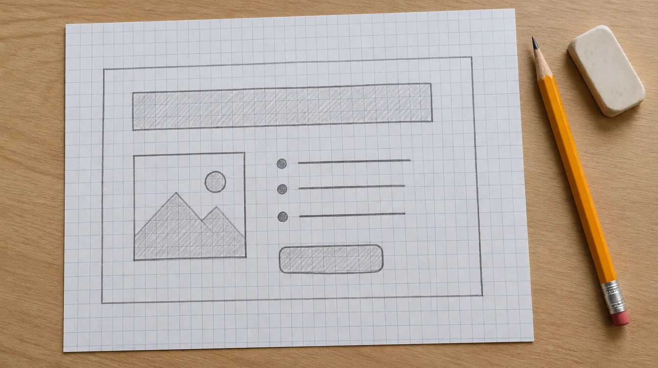
Quick answer: a landing page for a small business needs five things, in this order: a headline that says what you do and where, proof that you have done it, what happens next, one button, and a form or phone number that actually reaches you. Everything else is optional. Most landing pages that fail have too much on them, not too little.
Below is what goes in each section, what to leave off, how to tell whether the page is working, and the questions people ask.
What is a landing page supposed to do?
One thing. A landing page exists to get a person who has just arrived to take a single action: call, send a message, ask for a quote, book. Every line on it either helps with that or gets in the way.
That is why it is shorter than a website and why the menu is usually gone. Someone taps a link about boiler repair and lands on a page about boiler repair, and nothing else. If the page says what the link said, they stay. If it opens with your company history, they leave.

1. The headline and the first screen
On a phone, the first screen is the whole page for most visitors. It has a few seconds to say what you do, where you do it, and what to do next.
What belongs on it
- A headline in the words a customer would type into a search bar, not your company slogan
- The town or area you cover, if you work locally
- One line on what happens when they get in touch
- The button or phone number, visible without scrolling
- One real photo of your work or your team, not a stock handshake
A quick test: cover the logo. Could a competitor in the next town put the same headline on their page? If yes, it is too general. “Boiler repair in Almelo” says more than “Quality heating solutions”, because only one of them tells you whether the page is for you.
2. Proof
People landing on an unfamiliar page are quietly asking whether you are real. Proof answers that, and the specific kind works best.
- Photos of work you actually did, with a line on what the job was
- A customer quote that says what was done and what changed, not “great service”
- Anything checkable that applies to you: a licence number, years trading, a registration, a Google rating that links to your listing
- A job count, only if it is a real one
“Replaced the boiler on a Thursday, heating back by the evening” says more than five stars. If you have no reviews yet, ask your last three customers one question: what did we do, and what difference did it make? Their answers are your first proof.
3. What you do and what happens next
Describe the service in plain words and say how it works. People hesitate because they cannot picture the next step, more often than because they dislike the service.
- What the service includes, in two or three lines
- The steps, written for your own business. For example: you message us, we reply within a day, we agree a price, the work starts
- What it costs, or how the price is worked out, even if all you can give is a starting point or an honest “it depends, and here is what it depends on”
A page that names no number loses the people who assume the worst. If you cannot give a price, explaining how you arrive at one does most of the same job.
4. The one button
Pick one action. If you offer a call, a form and a WhatsApp message, choose the one most of your customers prefer and make it the big one. The others can sit beside it, smaller.
- Say what the button does. “Ask for a quote” or “Book a visit” beats “Submit”
- On a phone, make the number tap to call
- Repeat the button after each section so nobody has to scroll back up

5. The form
Every field is a reason to leave. A name, a phone number or email, and one line on what they need is enough for most services.
- Ask only for what you need to reply
- Say what happens after they send it, and how soon you will answer
- If you collect personal details from people in the EU or UK, add a short note on what you do with them and link to your privacy page
- Test it from a phone that is not yours, and check the message really reaches you
The failing form is the most common silent leak. The page works, the form submits, and the message lands in a spam folder or an inbox nobody opens. What happens after the enquiry arrives matters as much as the page, which we covered in losing leads at the reply, not the ad.
What to leave off
| Leave off | Why |
|---|---|
| The navigation menu | It gives people eight ways to leave |
| Auto-playing sliders | They change the message while the person is still reading it |
| Your company history | Customers want to know what you can do for them first, and it fits on an about page |
| Several different offers | Each one pulls attention from the others, so give each its own page |
| Music or video that plays with sound | People are often reading in public or at work, and they close the tab |
How to tell whether it is working
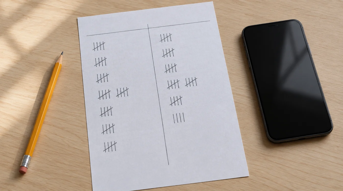
You do not need an analytics course. For the first two weeks, count three things: how many people visited, how many called or sent the form, and how many of those were real enquiries rather than spam or wrong numbers. Ask every new caller one question, how did you find us, and write down the answer. A paper tally sheet is enough.
I cannot give you a number that counts as good. It depends on the trade, the town and where the visitors come from, and anyone who quotes one without knowing those is guessing. What you can do is compare. Change one thing, count for another two weeks, and see whether the ratio of enquiries to visitors moves.
What it looks like on a real one
Alex, the plumber and heating engineer in Almelo, keeps his phone number in the header on every page. The site shows recent jobs and lists the area he works in. Those are the same ingredients described above, spread over more pages because his customers search in more ways.
At the other end, our Villa Serayu concept does the same job on a single page: one scroll, four chapters and one next step at the bottom. It is a concept, not a client, and you can open it here to see how little a page needs when it knows what it is for.
Four mistakes that cost the most
Starting with yourself. The visitor arrived with a problem. A page that opens with your history makes them dig for the answer.
Offering several next steps. A call, a form, a download and a newsletter sign up are four decisions. Most people make none.
Checking it only on a laptop. Many visitors from an ad or a message arrive on a phone, so a page you have only seen on a big screen has not really been checked.
Changing five things at once. You will never learn which one helped. Change one, count for two weeks, then change the next.
Your checklist before you publish
- The headline says what you do and where, in a customer’s words
- The button or phone number is visible on a phone without scrolling
- There is at least one photo of work you did
- There is proof that names what was done, not just praise
- The steps after getting in touch are written down
- Pricing, or how pricing works, appears somewhere
- The form has been tested from a phone that is not yours, and the message arrived
- There is only one main action, and a way to count how often it happens
Questions people ask
How long should a landing page be?
As long as it takes to answer what a visitor needs to know before acting, and no longer. For a simple local service that is often a few screens of scrolling. For a bigger decision, such as a renovation, it can be longer.
Should a landing page have a menu?
Usually not. A menu offers a way out, and the page has one job. A logo that links home and a visible button are enough.
What is a good conversion rate for a landing page?
There is no honest single number. It varies by trade, town and traffic source. Track your own for two weeks, change one thing, and compare.
Should I put my prices on it?
If you can, yes, or at least a starting point. If your prices vary, explain what they depend on. A page with no number at all tends to lose the people who assume the worst.
Can I build one myself with a page builder?
Yes, if you have the content ready and the time. It costs less money and more hours, and the hours are where most people stall. The photos, the proof and the wording are the real work, whoever builds the page.
How is a landing page different from a website?
A landing page has one job and usually no menu. A website has several pages for several jobs. If you are not sure which you need first, read landing page or website: what to build first.
Where to start
Open a blank note and write three lines: who the page is for, what they want, and the one thing you want them to do. Write the headline last, using their words, not yours.
If you would rather have it built, the websites and online stores page sets out what each size includes, the pricing page has the costs, and the portfolio shows finished work. If the page is live and the visitors are not coming, the video ads and UGC content page covers sending them. Everything is at giusmastery.com.


